By Marianne Beard
2017 has been a year of innovation for many facets- graphic design is no exception!
A company’s graphic design is used to reveal its brand and uniqueness- so its important to the know the latest trends and incorporate them as needed. Here are five areas that are evolving this year.
Fonts
With the rise of free typekits like Google fonts, non-traditional fonts are now everywhere- and in many cases FREE! Custom fonts are helpful in branding your company, as they are distinct and modern. Handwritten fonts, mix and match type and large, bold typography are huge trends of 2017.
For example, Dropbox has adopted the use of hand-drawn illustrations in everything they do. It has become part of their brand now and is easily recognizable.

Bolder, Brighter Color
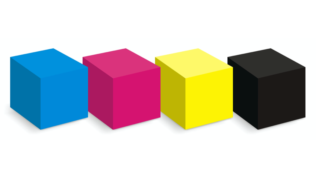
Over the past few years, several big brands internationally used muted, safe and straightforward to digest colors. This was in an effort to form a clean and controlled style theme. Now, in 2017, there has been a shift off from neutral colors like whites, grays and black, to bolder and brighter colors.
By adding more vibrant color, companies can give their branding a fresh new look without straying too far from what made them great.
Instagram is a great example of using brighter color to freshen their logo and brand.

Minimalism
Minimalism has been a growing trend in general- this most definitely includes graphic design.
Minimalist design is about a return to the basics of contrast, space, organization, color, dominant visual and typography.
Minimalist design is a great option for a number of design projects. It can stand out against all the other design clutter because it’s different. Think of those community bulletin boards and how many things are crammed into every poster. Go minimal and yours will grab the eye of passersby first.

Authentic Photos
With the popularity of stock image sites and the need for high quality images, the best generic images are being overused by everyone. It’s important for companies to start using authentic, original images that represent their brand. By doing this, companies add the human element back to their images that so many stock photos are missing.
Everyone on your team has a camera phone in their pocket. Snap a few photos of your office or some fun pictures of your logo and use those instead. If you’re lucky enough to have a team photographer, tap into their skills and think outside of the box when it comes to photos for your collateral, website and social media.

Logos
Many new trends have emerged in logo design in 2017. Five of the most dominant are:
· Minimalism- Say more with less. It is often the simplest designs that catch the eye.
· Hand drawn- Hand-drawn designs feel fresh, comforting, human and grounded. They convey a unique brand and are difficult to duplicate.
· Negative space- Negative space designs are attractive, clean and have the power to enhance your brand value.
· Line art- Thin lines give a fresh, modern and clean look to your brand.
· Vintage- These logos convey as sense of creditability and sensibility.

Running a business is more challenging than ever before. Get the marketing support and training you need to grow your business. Time to Thrive includes live events, marketing mastermind, core training and group coaching. Click the button below to learn more!

Recent Comments